Friday 31 August 2012

Another bunch of R (and JAGS) scripts

Probably sooner than I expected, I have managed to also upload the codes for the examples in Chapter 5 of the book, which deals with doing Bayesian health economic evaluations. Basically, there are 3 examples, which sort of represent the main classes of cases (of course there are many, many other types of models that can be used and these are by no means exhaustive. But if you learn to do these, you can start working in health economics with reasonable confidence...).

1. The first example assumes individual data (eg, but not necessarily, from RCTs) on the pair of variables $(e,c)$, representing a suitable measure of effectiveness (eg, but not necessarily, QALYs) and cost. The tricky part is that, as seems reasonable, these two quantities will tend to be correlated. This of course needs to be accounted for when modelling the data, with the added complication that neither can usually be associated with Normal distributions.
Sometimes it is possible to make transformations to approximately reach normality, but there is still the issue of correlation. One easy-ish way of dealing with this (especially if you're a Bayesian) is to de-compose the joint distribution $p(e,c\mid\boldsymbol\theta)$ as the product $p(c \mid e,\boldsymbol\phi) p(e \mid \boldsymbol\psi)$, effectively using a regression specification.
The examples provide the same structure for different distributional choices and I'll soon post some variations based on mixture models to better account for the possibility that some individuals have observed null costs (for example, subjects among the controls that happen to require no extra care at all).

2. The second example deals with evidence synthesis, ie the situation where there is composite evidence coming from different sources, that can be combined to estimate several parameters of interest. 

In this case (see the graph), I consider a model that has $H$ studies estimating the probability of infection with influenza, which via a hierarchical model is given by $p_0$. Moreover, there are other $S$ studies investigating the effectiveness of some treatment, which again via hierarchical modelling is given by $\rho$. Then these two can be put together to estimate the probability of infection for the subjects treated  with the prophylactic drug as $p_1=f(p_0,\rho)$, for a suitable function $f(\cdot)$.

3. In a way this is the king of health economic evaluation methods, since increasingly often people use Markov models (MMs) to do their cost-effectiveness analysis.
The idea is to model the transitions of a cohort of individuals among a set of "states". Initially, we can assume that everybody is healthy; then, as time progresses and according to some transition probabilities (ie the quantities that are normally to be estimated, indicated as $\lambda_{hk}$ in the graph above, for the transition from $h$ to $k$), they start to move around and eventually (if the model is so-called "life-long") they all die.
The example in the book is not too complicated and MMs can be quite tricky to run (just like the HPV model we're trying to extend). But I think it gives a (slightly more than) basic idea of how they should work.

Wednesday 29 August 2012

Serendipity (again)

[this time without John Cusack]. 
This is really weird! I was taking a little break from work (honestly: I've just finished back-to-back meetings with two students and I had previously read their theses the whole morning. So well deserved!) and took a few minutes to check one of those ridiculous websites giving all the news about the football transfer windows. I know: they are really stupid and don't even give real news $-$ only rumours and jibber jabber. But even I sometimes indulge in checking what Sampdoria do, especially in weeks after a win (actually I should say "only"; when we lose, they're dead to me until the next game).

Anyway: I was reading (not without interest) about Tissone probably remaining at Samp and while scrolling down the page I realised that this time the advert was slightly more interesting...


(I swear to God I'm not making this up).

That's probably because I was logged in Chrome with my gmail account or something like that. Also, when I think about it, this is most certainly an incredible violation of my privacy (presumably Google, but probably not just them), but it has, stupidly, felt quite nice...

And after all, I do mention Sampdoria in the book in $\S$2.2.1...

Tuesday 28 August 2012

Seriously George: worse than Clegg?

Nothing much on the telly tonight, so I'm catching up with the blog... The Guardian has published this update on net approval ratings for some top politicians in the UK. These are computed as the difference between the proportion of people approving of a certain politician and those not approving of them. 

I took the original data and made this simple plot of the ratings against the last few polls, running from when the new government was voted in (June 2010) to a couple of days ago.


As is evident, in the last two polls (ie after revealing the new budget last March), the chancellor George Osborne is plummeting down in the ratings and is now even below the deputy Prime Minister Nick Clegg. 
[To put this in perspective if you're reading and are not familiar with the UK political scene: earlier this month, I was out having drinks with a few friends, one of whom happens to live in Putney in the same street as Clegg. He told us that one time a few months ago he could not get home because the narrow street was all blocked by protesters demonstrating against him.]

Until December 2011, it seems as though the coalition ratings (in green, as is the combination of blue/Tory and yellow/LibDems) were basically following Cameron's (the blue solid line) and Osborne's (the blue dashed line, slightly above his leader), with Clegg mainly responsible for "bringing the average down" (though the coalition rating is technically not a simple average).

But since the budget, it is mostly Osborne who has driven the downwards trend of the coalition. If the polls are anything to go about, Cameron has also suffered but, unfortunately, dare I say (I'm not a great fun, to put it ridiculously mildly) is now sort of stable. Clegg is may be even, very marginally, benefitting from this. Even more interestingly, the British public seem to like no-one at the moment. But I guess this is kind of typical in political science, in between elections?

UCL symposium - October 18th

That's just an advert for the UCL Partner Biostatistics Network Symposium "Contemporary Statistical Methods in Medical Research". This is the 2nd edition; last year I organised it. In fact, at the last minute I had to fill in for one of the speakers who were supposed to give a talk and then bailed out on us.

This time I am only supposed to chair one session and, apparently, "facilitate wider participation and dissemination", which I am pretending to do by blogging about it. The session I'll chair is about Infectious disease modelling and I'm assuming that Marco (who's organising it this year) gave this to me because (hopefully; that would make my job easier...) there is some Bayesian aspects involved in the talks.

Anyway, the general idea and format are nice, I think. We identify three main areas of research in medical statistics, identify three key note speakers and three younger researchers and ask them to give longer talks on them. The whole thing is informal and, at least to go by last year, the audience tend to include clinicians, applied and methodological statisticians. 

Last year we had nearly 100 participants (which was really good). I'm not sure how the situation is in terms of places still available, but if you're reading this and are around London mid-October, drop Marco an email and see if you can join us!

I hate that guy!

Well, I don't literally hate that guy; and I haven't thought about this in a while, so things are probably changed. But a couple of years back, after serious consideration, I had decided that John Cusack was, by far, my least favourite actor.

He had a string of movies which consistently sucked (of course this is just my very subjective opinion $-$ but seriously: they seriously...) and I couldn't really stand the guy. 

I thought of this when I was finishing writing a new grant proposal (which I've submitted last Friday). Among other jems, James, one of the co-applicants, added in the text the word "serendipitously", which I thought was just amazing $-$ despite the sad memories it brought back of John Cusack.

Anyway, I really like James: he is a clinician and and enthusiast supporter of Bayesian methods, even in his applied research, which is very rare! But more importantly, he is one of those people with an incredible culture, which transpires in the way he writes, including the fancy, mostly unheard of, words. Other examples include: "dirigiste" and "egregious" (as in "the cost can be egregious").

The proposal is titled "Interpreting lower urinary tract symptoms using Bayesian methods: improved diagnostic inference, faster delivery, less investigation and lower costs". I think the idea is really cool: briefly, lower urinary tract symptoms (LUTS) are clinically a big deal because they may be indicative of serious pathologies of the urogenital tract, including cancers. But they often go mis-diagnosed, often because doctors look for presence/absence of signals in diagnostic tests, which are quite noisy.

Our proposal, on the other hand, is about using data and expert opinions to estimate the underlying probability of the potential causes, given the symptoms. Some preliminary evidence seems to suggest that this could improve effectiveness and even save money in the long run; thus we'll also include a cost-effectiveness component. The idea is to first validate the system in James' hospital and then trial it on a few NHS hospitals and, possibly, in a couple of different areas. 

Thursday 23 August 2012

INLA functions

I've had this idea for a while, and may be I'm finally coming around to doing it. Recently, I've been doing some work using INLA and while I was at it, I have written some very simple R functions that would do little pieces of analysis that I thought were useful.

As is often the case, at first I just wrote them for the specifics of my problem $-$ something quick & dirty. But then I thought that they may be helpful in more general situations and so I started to code them in a better way to make them into proper functions.

The basic setup considers a Bayesian hierarchical model 
$$ y \sim p(y \mid \theta) $$
$$ g(\theta) = X\beta + \alpha $$
where $\beta$ is a set of unstructured effects and $\alpha$ represents the structured effects. The function $g(\cdot)$ of course depends on the way in which the model for the data $y$ is specified. Typically, the coefficients $\beta$ are given independent minimally informative priors, while $\alpha \sim \mbox{Normal}(0,\tau)$, where $\tau=1/\sigma^2$ is the precision.

The first function simply computes some summaries for the structured effects in terms of their standard deviation (rather than the precisions, which is the INLA default). I've used the R-INLA built-in function inla.rmarginal which allows to sample from the posterior marginal distribution of one of the variables monitored by the procedure and effectively produced a sample from the distribution of $\sigma$. Then, I simply replace the table with the results reporting summaries for $\sigma$ (instead of $\tau$). [In fact, R-INLA also lets you compute analytically the mean and the standard deviation for $\sigma$, using inla.expectation and some easy algebra (see for example page 7 here).]

The second function computes the Bayesian p-value for the unstructured effects. In other words, the code allows to compute the posterior probability that one of the coefficients in $\beta$ is positive (or negative, depending on its sign), again using inla.rmarginal and effectively inserting a step of Monte Carlo inside INLA.

I mentioned all this to HÃ¥vard Rue, INLA's dad (and incidentally, one of the nicest guys around!), and he got back to me with an interesting idea to sample from the marginal posterior of the unstructured effects accounting for possible correlation among them. I've not had time to think about this, but it looks cool, so I'll try to fix it into the current code.

I'll say more when all is ready to roll.

Silvio, the NHS and Tasmania: what a combo!

When he was in power, in addition to a funky mood all over the country, sexy Silvio used to promise Italian voters less taxation across the board. Meno tasse per tutti ("less taxes for all") he used to say. Ã‡a va sans dire that: i) it didn't really happen; and ii) whatever else went on, wasn't very fruitful for Italy, as the current situation testifies. 
[Digression 1: Truth be told, it's not just Silvio's fault, I think; those before and after him didn't help either. But, boy did he do his best to screw things up!]

I thought of this while I was reading of a new study that has just come out, which discusses health- and lifestyle-related habits in the UK population. Not surprisingly (I would think), the main conclusion is that people in the UK are overall improving their lifestyle, drinking and smoking less than they were previously. 

However, again not entirely surprisingly (just like the fact that Silvio's tax promises didn't come true), this applies effectively only to the middle and upper class, while people in more deprived conditions are still very much affected by very risky habits. This of course has clear repercussions on their health, making them at far higher risk (up to 5 times as much, according to the report) to develop cancer, cardiovascular diseases, etc $-$ all leading to much lower quality of life and higher cost for the NHS.

I suppose this begs the question (which, as far as I can tell, the report doesn't answer) of whether the massive investments to promote healthier lifestyle, by both Labour and Tory governments in the last 10 years at least, have been actually good value for money. That's of course a very tricky business; it's complicated to develop interventions that everybody can take up equally (or even better, incrementally according to the underlying need), and the class divide in this country is really striking.
[Digression 2I know: that's an extremely naïve point to make, but as someone who wasn't born but lives here, the realisation is quite a slap in the face! I may be subject to some bias in saying this, but to my recollection, this was not the case, when I was growing up in Italy. Sure: Silvio & friends (on either side of the political spectrum) were most definitely better off. But I seem to recall that most people would have considered themselves "middle class". Extreme poverty and deprivation did exist, especially in the South of the country, but I didn't think the class system was so damning, back then. I'm afraid things are changing for the worse now?]

Anyway, the evidence points to the direction of clear effectiveness (and presumably cost-effectiveness) in some groups, but no effectiveness (and most certainly no cost-effectiveness) in others. So I ask myself: are we good enough in applying these interventions? Should we work even more towards stratified interventions that apply differently to different sectors of society? 

Also: do we leave people too much freedom to actually take these interventions up? Should we do like the state of Tasmania (Australia) who is apparently thinking about issuing a complete ban on smoking for everybody born on or after the year 2000? No free will there: we know by now that smoking is bad and so nobody will. 

I've no solution here: on the one hand, isn't it wrong to know that something is really bad for the individuals (especially so for those who are worse off to start with) and society as a whole, and still allow it $-$ and even make some money out of it, at least in the (very) short run? 
[Digression 3: Just to be clear: I'm talking about smoking here, not voting sexy Silvio back in power. Surely that will never happen again? Or will it?] 
On the other hand, however, there's plenty of evidence (this is kind of related) to show that just because something becomes illegal, that doesn't mean people will stop doing it... 


Wednesday 22 August 2012

Finding thetas in Europe

I love the name of this conference $-$ that's one of the geeky-est things I've ever heard! The organisers are social scientists and aim at building a scientific network of (European) Bayesian applied statisticians. I may even go...

The only thing I would complain about is the logo:


First of all, there's only one $\theta$ in it, so to find more than one is quite difficult. Also, with such a big $\theta$ covering most of Europe, it doesn't really take a scientist to find it, does it?

Saturday 18 August 2012

How do we judge worse than the worst?

The Italian film industry are quite weird. In particular, they are curiously inventive when they translate the original title of foreign movies. Here are some of my favourite examples.

Tuesday 14 August 2012

Sweet 16

The birthday paradox is very funny (well: geek-funny, at least). You may think that it's pretty unlikely that someone you know shares your birthday. In fact, if you know a large enough number of people, the probability of this circumstance goes to 1. 

And even if you only have 10 friends, there's still a probability of nearly 12% that one of them was born on the same day as you. Even more strikingly, if you have as little as 23 friends the probability that two of them share a birthday is 50%!

In my case (I turn 16-ish today), this is fully respected. I do have one friend (Russell) who has his birthday today as well. Moreover, my friend Lorenzo has his on the 15th (that's close enough, and actually at one point, when I was living in Boston, we celebrated both our birthdays at the same time $-$ it was already the 15th in Italy, but still the 14th in the US).

Other very close friends do share their birthday with me: among them, Guido Castelnuovo and Mila Kunis(OK: perhaps I don't seem them as much, Guido having lived in the 19th centrury and Mila being busy in Hollywood. But that doesn't make us less friendly...).

Wednesday 8 August 2012

+18 medals, but plus or minus what?

This is my last post on the Olympics: promised! My friend Stefano posted this link to an article in (one of the very few) Italian respectable newspapers (more or less the same as this, which is in English).

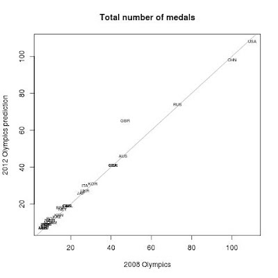
I took the data resulting from Goldman Sachs' analysis (usual digression and probably cheap moaning: don't these people have something far more important to do, eg stop draining money, than wasting their time playing around with this?) and plotted this.


That's the comparison between the observed number of medals won in Beijing and their prediction for the number of medals won in London. Most of the countries seem to lie on the 45 degrees line, which means that they are expected to replicate last time performance. The outstanding countries are effectively Team GB and, only marginally, Italy. The US and China are predicted to do slightly worse than last time around (a difference of just 2 medals).

My comments to this are: 
  1. I think the results reported are a bit confusing. In fact, the data are only given for the countries that have won some medals in Beijing and are predicted to win some in London. But in this way it is not very clear who are losing out and how much so. In the data made available, only the US (-2), China (-2) and Jamaica (-1) are predicted to have fewer medals than in Beijing. I think it would have been better to report the complete list of medal winners from Beijing in the their table.
  2. I think the model gives a bit too much weight to the "home effect" (ie the increase in the number of medals due to the fact that a country is hosting the event). Team GB are doing extremely well and have already exceeded their remarkable performance of four years ago, but may be the estimation of an increase by 18 medals is a bit too optimistic. Also, it would have been interesting to see the prediction for China given all the data before Beijing to check how reasonable the "home effect" was.
  3. I'm not sure why Italy are predicted to do a bit better that previously $-$ presumably that's something to do with GDP (one of the variables included in the model)? As I've mentioned somewhere else, I think that GDP is only one side of the story as it doesn't necessarily reflects investment in sports. If you can read Italian, perhaps you can have a look at this $-$ I think I agree almost entirely. 
  4. More importantly, both from the statistical and substantial point of view, the exercise is all about prediction (or at least the headline is). But what they have spectacularly failed to do is to report any measure whatsoever of the variability associated with their estimation. Surely their prediction will be based on reasonably different extremes, to account for uncertainty?
All in all, I think it's funny how we (I mean myself included) get sometimes carried away with this insane need of putting our day-to-day job (and supposed expertise) to use for big events, like the Euros, or the Olympics.

I asked Lizzy to declare the Olympics close on the first Sunday, when we were ahead of the game (sadly she didn't). But perhaps now it's really time she does!

Monday 6 August 2012

A bunch of R (and JAGS) scripts

I finally (nearly) got around to prepare the R code to replicate the examples in the book. I divided the examples by chapter and then linked to the R scripts and, for those involving Bayesian analysis, the associated JAGS models.

At the moment, the scripts basically cover 3 running examples (discussed in several parts of the book):
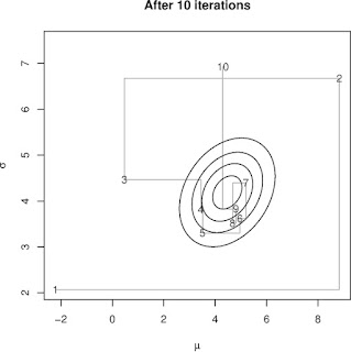
  1. MCMC.R. A Gibbs sampler for the very simple case of a semi-conjugated Normal model \begin{eqnarray*}y_i &\sim& \mbox{Normal}(\mu,\sigma^2)\\ \mu\mid\sigma^2 & \sim & \mbox{Normal}(\mu_0,\sigma^2_0) \\ \tau=1/\sigma^2 &\sim& \mbox{Gamma}(\alpha_0,\beta_0)\end{eqnarray*} to show the basics of the method. That's all written in R and I also provide some additional code to make some plots, showing convergence varying the number of iterations, something like this:


  2. normalModel.R. A linear regression model \begin{eqnarray*} y_i & \sim & \mbox{Normal}(\mu_i,\sigma^2) \\ \mu_i & = & \alpha + \beta x_i \\ \alpha,\beta & \sim & \mbox{Normal}(0,h^2) \\ \log(\sigma) & \sim & \mbox{Uniform}(-k,k) \end{eqnarray*} This has several slightly different specifications to show how things change when centring a covariate, or selecting a longer burn-in for the MCMC, or using thinning. There are actually two versions of this script and this modifies the original model to include blocking to improve convergence and estimate the predictive distribution. Both versions also include the JAGS code to run the different models.
  3. HEexample.R. This runs a (reasonably simple) health economic model whose aim is to estimate the cost-effectiveness of a new chemotherapy drug. This actually consists of two steps. The first one specifies the model in terms of a set of relevant parameters. These are estimated through MCMC (and the JAGS code is provided). Then, using BCEA, the actual cost-effectiveness analysis is run. The script provides the code to run the basic analysis, as well as more advanced ones (including the computation of the Expected Value of Partial Information, model average to account for uncertainty in model specification, decision-maker's risk aversion and the mixed analysis to consider non-optimal market configurations $-$ I've discussed this here).
Soon(-ish), I'll add the code for the examples in chapter 5, which are specific health economic evaluations. These are also a combination of R and JAGS codes that basically set up and run the Bayesian model via R2jags and then post-process the results to produce the health economic evaluation.

Curiosity killed the cat

While I was taking Marta to the station earlier today, I heard on the radio that NASA has successfully sent Curiosity, a mobile laboratory, to Mars. Apparently, this is a £1.6 billion 98-week mission (the length of one Martian year), whose aim is to explore a crater that billions of years ago may have been filled with water. 

I have to say I'm a bit torn on this one: on the one hand, I think it's an incredible achievement and there is the possibility of gathering evidence to substantiate the possibility of "compatibility with life" on the red planet. I can see the scientific importance of this question and I kind of understand the excitement of the space community (I know: put it this way, it sounds more like an after school activity, but you know what I mean...).

On the other hand, I wonder whether at this precise moment in human history, this is the best way of investing £1.6 billion of (sort of, or at least, partially) public money. But then again: is this the best time to invest (sort of, or at least, partially) public money to organise and run the Olympics? (By the way, I did have a lot of fun on Saturday watching the games in Hyde Park and then at Earl's Court).

I suppose you might argue that, from the very practical point of view, finding out right now whether we could actually migrate and live on Mars is a grand exercise in forward planning. So, when we'll have finally filled up planet Earth with too many replicas (or should I say replicae?) of us, we could branch out to Mars (which is only 9 months away $-$ and to think we bitch about our 1 hour commute into central London!).

Friday 3 August 2012

Who are the best team in the Olympics?

Given that I'm a Leo (since I was born in August) and that 2012 is an Olympic year, I thought that this would be quite nice and appropriate as my next favicon. I wonder if I'd get sued? 

[By the way, as I'm writing, Andy Murray, one of the people in my team, has just got into the final of the tennis tournament. Well done Team Me!] 

Anyway. I was reading an article in the Guardian, which discusses an alternative way of ranking the Olympic teams with respect to the medals table, produced by a group of statisticians at Imperial College. 

The obvious way is to simply count the number of medals won. But of course there is some confounding going on $-$ for example, bigger countries have a larger "pool" of potential athletes from which to get their participants. Similarly, wealthier countries could (theoretically) invest more money in sport, thus making them more likely to win medals.


So they have produced a few alternative ranking systems, based on weighting the observed numbers and accounting for a few key variables (although it's not very clear what they've actually done to produce the weights). 


I think that's kind of reasonable, but it doesn't account for (at least) one important factor: the underlying assumption is that every medal is worth the same. But that's not true for all sports. Some countries, albeit small, may be powerhouses in a given sport. Thus, winning a medal is not quite so unlikely: North Korea winning gold in judo is not quite shocking, is it?

Nevertheless, I think it's interesting to see that if you plot the official ranking against that based on each nation's GDP (which by the way I think would have been a much better way to report the data, instead of the big table given by the Guardian) only North Korea (PRK) remains in the top 10. 


Moreover, I'm not sure that GDP is actually the best variable to consider here: yes, richer countries have theoretically more money to spend on training athletes. But take for example Italy. We are in the top 10 official ranking but move to only the top 30 when accounting for GDP. However, in fact the actual amount of money that the government allocates to sport is quite low with respect to the actual GDP (possibly excluding football, as my hooligan wife suggests).